OOH
We embrace Out of Home advertising as a key element of our marketing strategy. We use formats like billboards, mupis, kiosks, bus shelters, and subway stations, among others, to ensure our message reaches strategically selected high-traffic areas, maximizing visibility and brand impact.
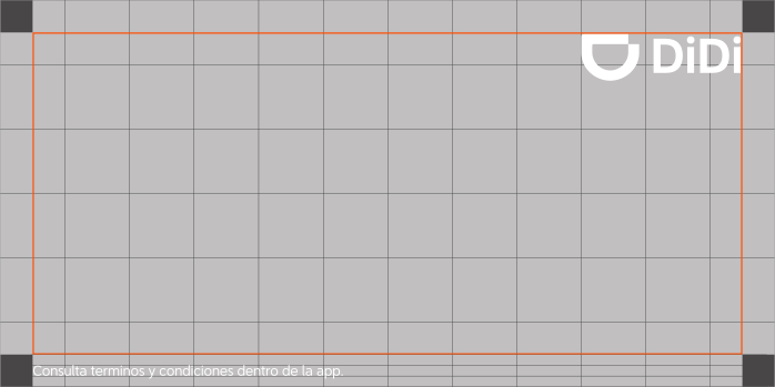
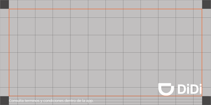
Horizontal Layout
For our horizontal advertising banner, the grid is composed of 13x7 modules X. The four corner squares are divided into four smaller squares, creating secondary squares in each corner. These secondary squares generate a line that evenly bisects the margin squares. It serves as a reference for placing the DiDi primary logo in the upper right and lower right corner (to ensure maximum visibility and brand recognition), aligned with the intersection of this line. In both formats, the logo’s width is equal to two and a half modules X.
- Download icons: Are optional depending on the market and the type of campaign.
- Copy-in: Must never be positioned at the same level as the primary logo.
- Each campaign has its own guidelines. It is crucial to review this grid with DiDi Studios to ensure consistency.
Download Horizontal Layout
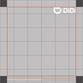
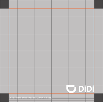
Square Layout
For our square advertising banner, the grid is composed of 13x13 modules X. The four corner squares serves as a reference for placing the DiDi primary logo in the upper right and lower right corner (to ensure maximum visibility and brand recognition), aligned with the intersection of this orange line. The logo’s width is equal to four modules X.
- Download icons: Are optional depending on the market and the type of campaign.
- Copy-in: Must never be positioned at the same level as the primary logo.
- Each campaign has its own guidelines. It is crucial to review this grid with DiDi Studios to ensure consistency.
Download Square Layout
Vertical Layout
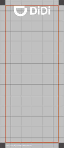
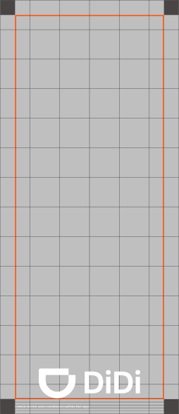
For our vertical advertising banner, the grid is composed of 7x13 modules X. The four corner squares are divided into four smaller squares, creating secondary squares in each corner. These secondary squares generate a line that evenly bisects the margin squares. It serves as a reference for placing the DiDi primary logo in the center at the top and bottom (to ensure maximum visibility and brand recognition), aligned with the center of this line. In both formats, the logo’s width is equal to three and a half modules X.
- Download icons: Are optional depending on the market and the type of campaign.
- Copy-in: Must never be positioned at the same level as the primary logo.
- Each campaign has its own guidelines. It is crucial to review this grid with DiDi Studios to ensure consistency.
Download Vertical Layout

 Back to top
 End Cards