Our logo

Think of our brand as a trio: the D'smile, Wordmark, and their united look.

Primary logo

The logo is a powerful visual representation of our brand identity, conveying our values of innovation, reliability, and user-centricity.
Don'ts

Our logo is a key part in our design. Follow the guidelines and avoid changing anything related to colors, orientation or composition.

To make things easier for you, we’ve put together a list of common mistakes that people tend to make while using the logo.
Don't distort or warp the logo in any way.
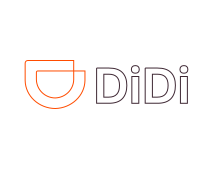
Don't outline the logo.
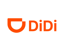
Don't change the color of the logo.
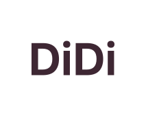
Don't remove the isotype from the logo.
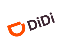
Don't rotate the logo.
Don't adjust the kerning.
Don't change the dimension of the D'Smile.
Don't change the typeface of the logo.
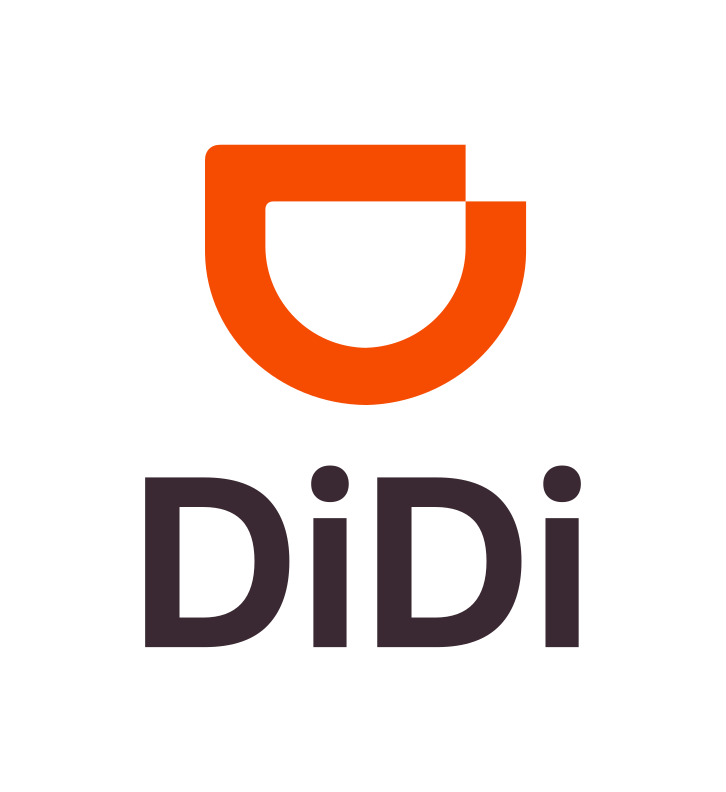
Vertical logo

D'Smile

Our D'Smile is like our way of saying "hey there!" It comes from the D in DiDi (in case you hadn’t noticed).
We reckon if we start with a smile, we might just get one back. How do we use it? When we want to put it in logo format, the D’Smile and logotype can't live apart. When it's an illustrative element or part of our orange world as a door to tell our stories, it can live separately.
Dont's

Our isotype is a key part in our design. Follow the guidelines and avoid changing anything related to colors, orientation or composition.

To make things easier for you, we’ve put together a list of common mistakes that people tend to make while using the isotype.

Incorrect

Don't distort or warp the isotype in any way.

Incorrect

Don't change the orientation.

Incorrect

Don't change the color of the isotype.

Incorrect

Don't rotate the isotype.

Incorrect

Don't add inner shadow.

Incorrect

Don't use a texture.

Breaking up the smile

These graphics visualize the different ways in which deconstruction can be effectively applied, adding a level of dynamism and uniqueness to the design.

Filled form applications

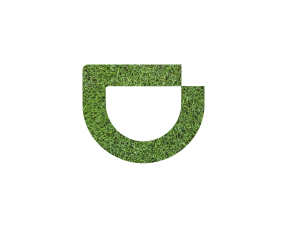
The isotype can be completely filled or intervened by a backgroundless photograph.

This approach allows for the visual integration of the photograph with the isotype in a coherent and effective way, highlighting the brand's identity in various applications.

Outlined application

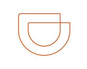
The outline isotype is part of the secondary graphics, designed specifically for exclusive use within the brand's territory. Its main function is to complement the brand's visual identity without compromising its readability or visual impact.

The following graphics illustrate the recommended applications and those to be avoided to maximize the effectiveness and visual coherence of the outline isotype.

Outlined isotype and photography

By overlaying the photograph onto the outlined isotype, a unique visual connection is created so that it reinforces the values and personality of DiDi, resulting in a memorable and distinctive visual identity.

Brand Family

Think of our sub-brand system like a family tree. Just as family members share some similarities, but each has their unique charm.

This helps us roll out new products or services and ensures our audience feels that familiar trust.

There are no results for your search.